
Shadcn Theme Editor
Effortless Shadcn Theme Customization Made Simple.
◦ Manage Shadcn theme colors with an intuitive UI.


📍 Overview
Shadcn Theme Editor is a user-friendly component designed to simplify the process of managing and customizing theme colors in Shadcn-based projects. This package provides an intuitive UI with buttons for different color properties, allowing developers to easily adjust and preview theme colors in real-time. Although the package is optimized for ease of use, its build size is substantial, so it is recommended to install it as a development dependency. This tool empowers developers to create consistent, visually appealing themes without diving into complex CSS, making it an essential addition to your Shadcn toolkit.
🚀 Getting Started
Installation
To install the package as a development dependency, use one of the following commands:
npm:
npm install shadcn-theme-editor --save-devyarn add shadcn-theme-editor --devpnpm add shadcn-theme-editor --save-dev📖 Usage
import default and add in app/layout.tsx file
import ShadcnThemeEditor from "shadcn-theme-editor";or (in this way, it doesn't include the component in the production build)
let ShadcnThemeEditor: any;
if (process.env.NODE_ENV === 'development') {
  import('shadcn-theme-editor').then(module => {
    ShadcnThemeEditor = module.default; // or module, depending on the module's export
  });
} else {
  // eslint-disable-next-line react/display-name
  ShadcnThemeEditor = ()=>null
}
and use
<ShadcnThemeEditor />Screenshots
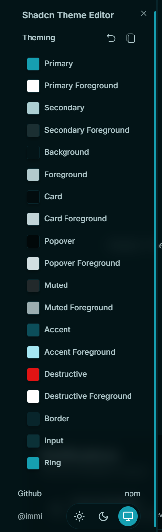
How to Use the UI
Upcoming Features
- use jln themes directly in your project
Special Thanks
I would like to extend my heartfelt thanks to the following individuals and projects:
- Julian - for creating ui.jln.dev, 10000+ Themes for shadcn/ui.
📄 License
This project is licensed under the ℹ️ MIT License.